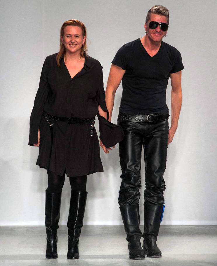
AF Vandevorst stands for the Belgian design duo of An Vandevorst (born ’68) and Filip Arickx (born ’71).
The husband-and-wife design team met in ’87 at the Royal Academy in Antwerp. On graduating, Vandevorst worked as assistant to Dries Van Noten. Meanwhile Arickx, who worked for Dirk Bikkembergs for three years as a teenager, completed military service after leaving the Academy and then worked as a freelance designer and stylist.
Together they established their own label in ’97, and presented their first collection in Paris for a/w ’98. The label quickly came to the attention of both the fashion press and establishment; after only their second collection they were awarded Paris Fashion Week’s Venus de la Mode award for ‘Le Futur Grand Createur’, a prestigious prize for newcomers. For the spring/summer and autumn/winter ’00 seasons the pair were invited to design the Ruffo Research collection, an opportunity periodically offered to young designers by the Italian leather house Ruffo.
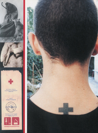
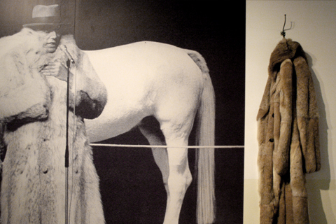
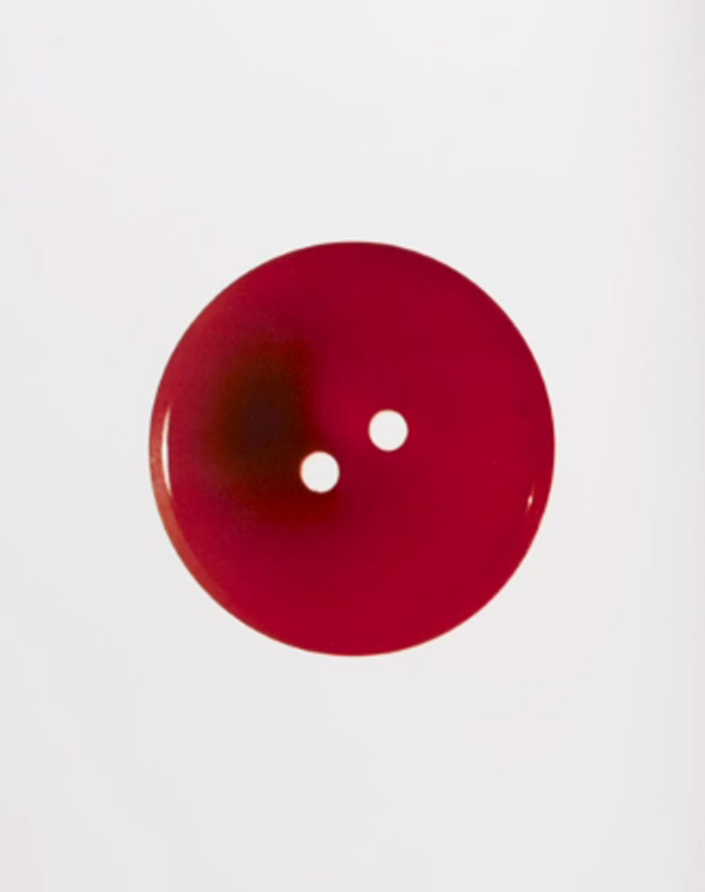
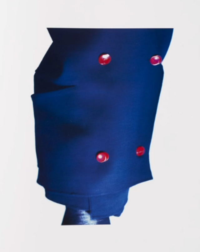
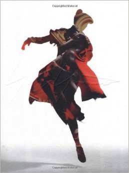
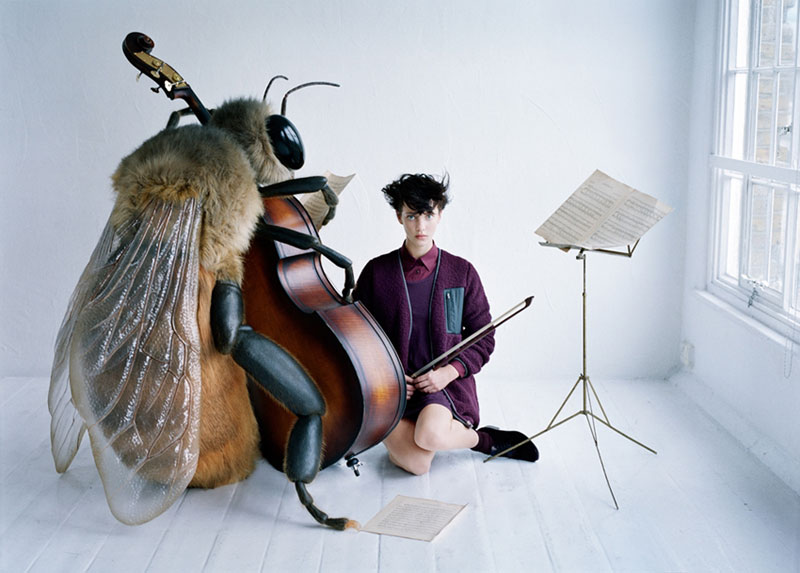
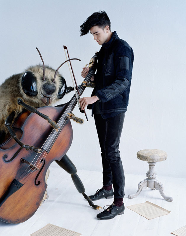
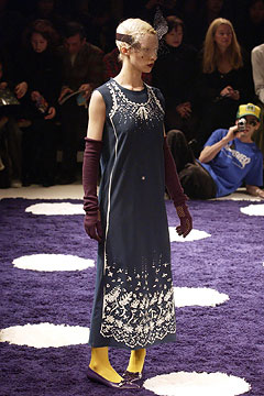
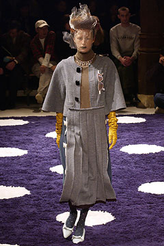
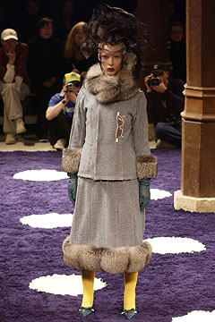
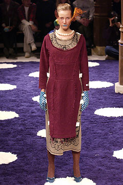
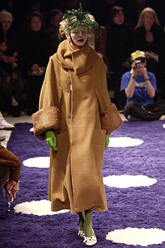
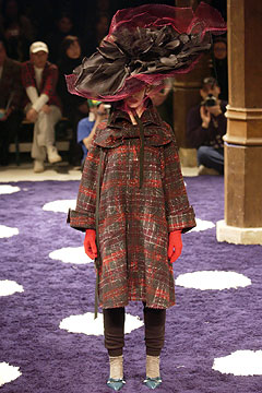
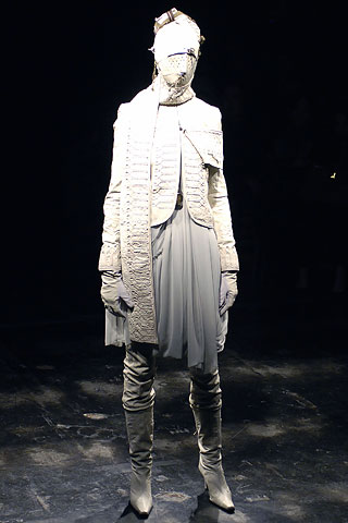
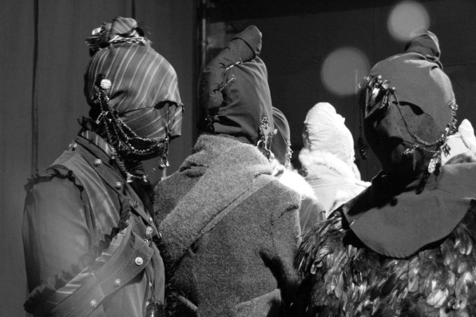
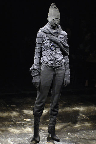
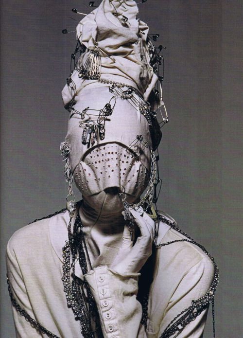
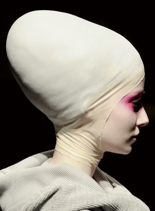
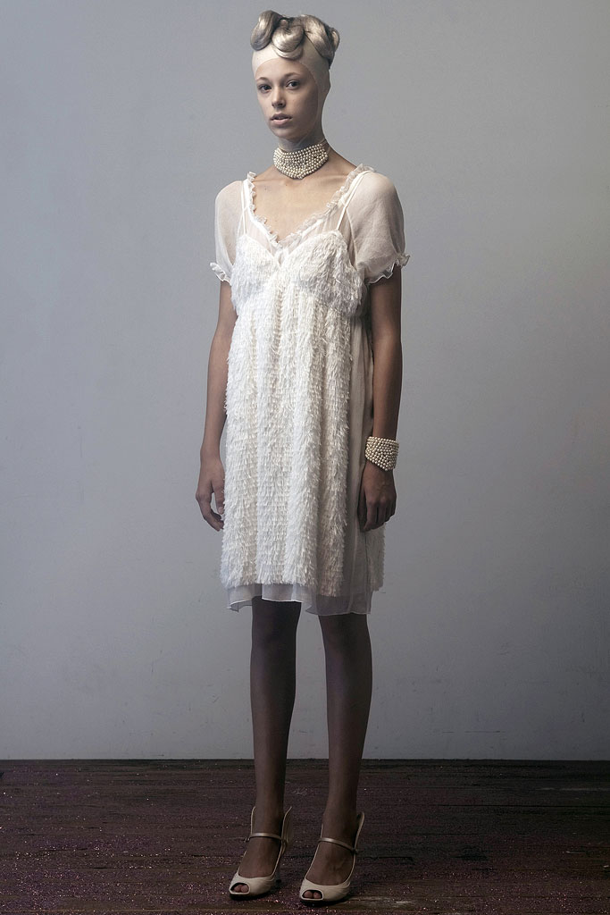
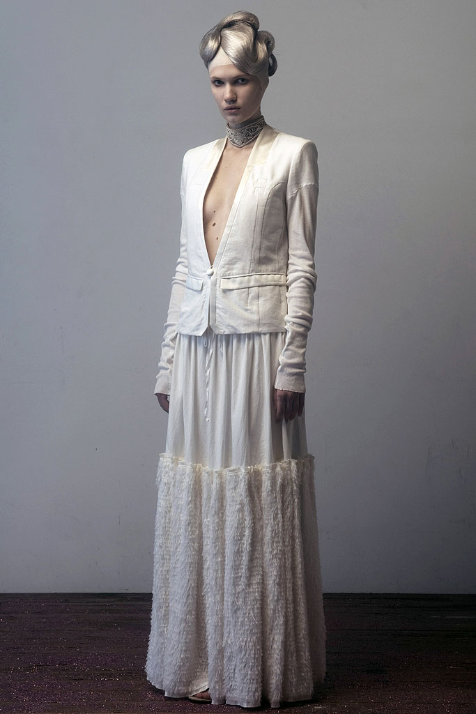
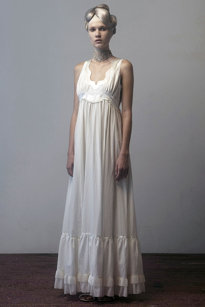
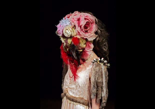
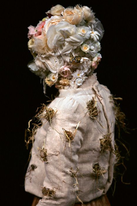
AF Vandevorst clothes convey a slouchy confidence and a version of femininity that evokes a sexy yet intellectual cool. Traditional clothing (horse riding equipment, kimonos, frock coats) is often referenced, reworked and refined until it sits slightly left-of-centre; amedical-style red cross is their enduring symbol. For collection themes, they often favour the unexpected, as for a/w ’03, when honey bees provided inspiration. Following no set colour palette, AF Vandevorst stray from muted tones into brights. The label expanded to encompass footwear, accessories and lingerie and they continue to present catwalk shows during the Paris collections.
Exhibition & Book
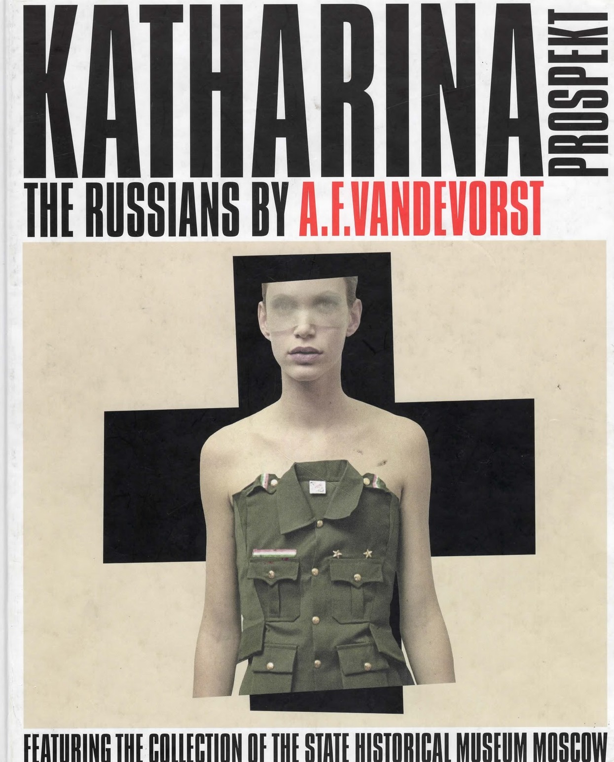
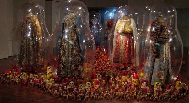
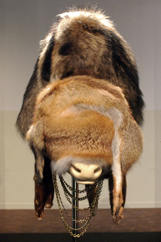
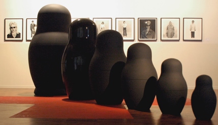
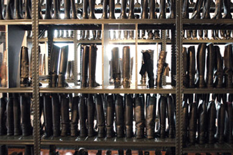
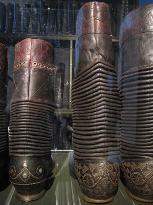
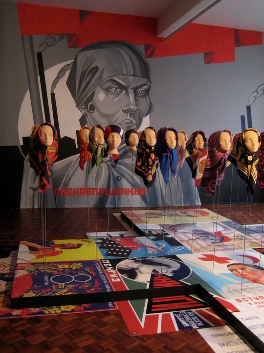
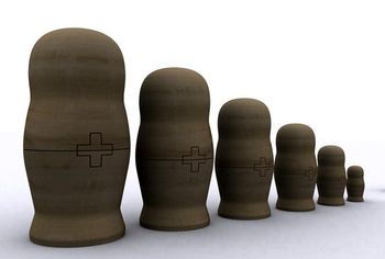
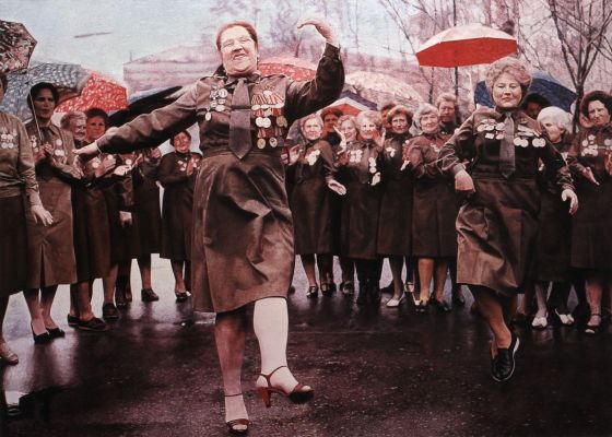
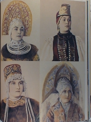
In ’05, An and Filip were asked by MOMU, the renowned Antwerp Fashion Museum, to curate “Katharina Prospekt” an exhibition based upon the couple’s impressions of Russia.
Exhibition “Katharina Prospekt”
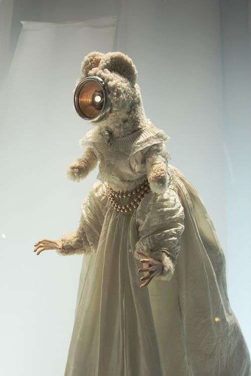
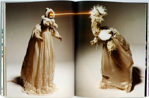
A series of objects or images inextricably linked to Russia: Russian matrioshkas or Russian dolls, vodka, the fur hat, the long queues of the Soviet era, the Volga … These stereotypes give a distorted image of contemporary Russia and obscure the diversity of its peoples, cultures, styles, and historical periods. By integrating these clichés into the scenography of the exhibition, A.F. Vandevorst makes us rediscover modern Russia. Like the Russian dolls which hold inside them a series of smaller dolls, the exhibition comprises several dimensions in which the historical collection of clothing of the State Historical Museum of Moscow is confronted with ever different contexts.
Curators:Tamara Igoumnova, State Historical Museum Moscow,An Vandevorst & Filip Arickx
.
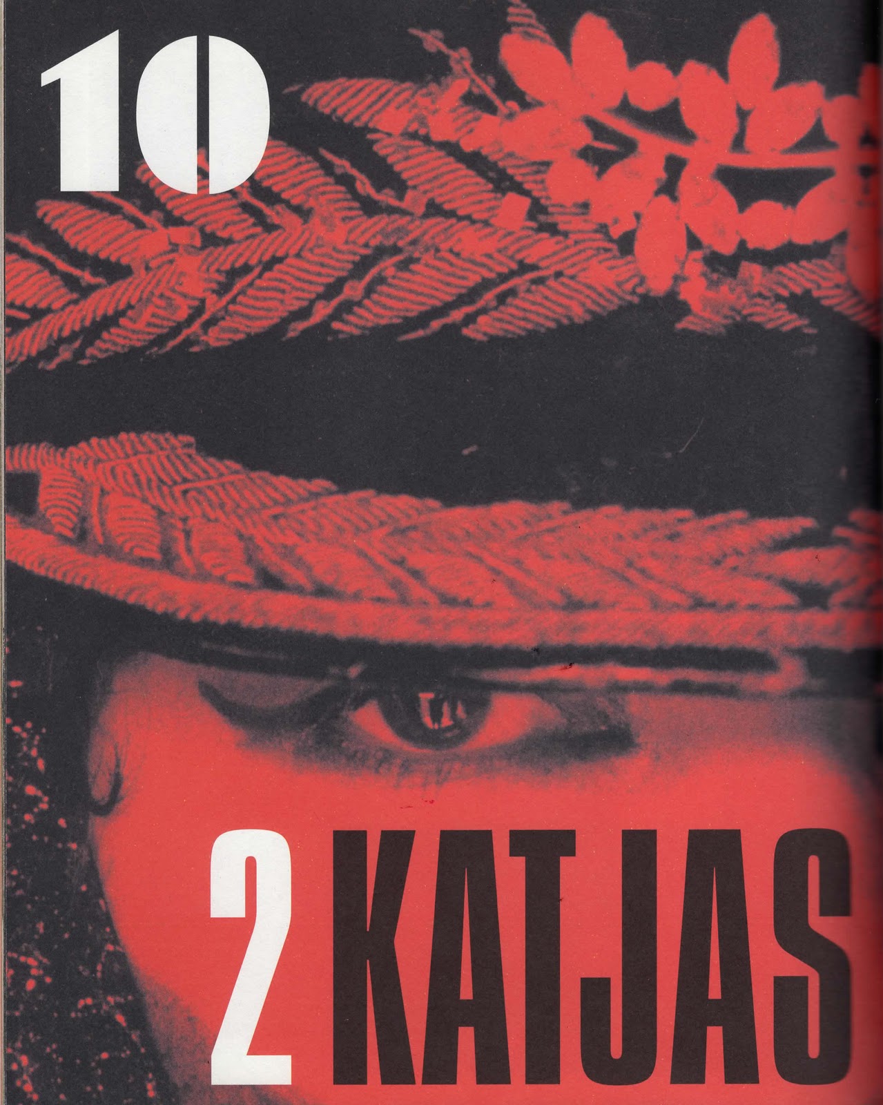
Book by the exhibition
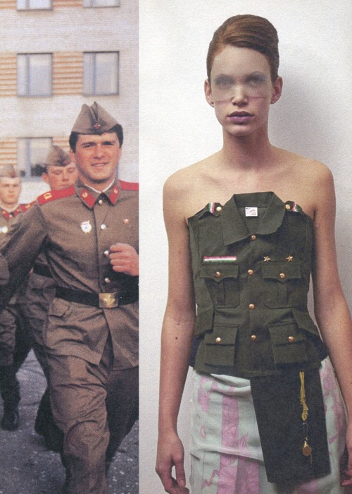
Fans of Belgian avant-garde fashion, Russian style and great book design, unite! This exceedingly seductive volume documents Katharina Prospekt: The Russians, a tour de force exhibition put together by the innovative Belgian fashion house.A.F. Vandevorst of Russian cultural artifacts borrowed from the State Historical Museum in Moscow, coupled with contemporary fashion designs by A.F. Vandevorst and others–including Yves Saint Laurent, Bless, Martin Margiela and Jean-Paul Gaultier.
There are sections on Propaganda, Military Design, Fur, Chess and even the iconic Russian dolls that fit one inside another. The bold typography riffs on Constructivist design, and we see antique objects, artifacts, textiles and costumes alongside vintage photographs and eye-popping contemporary fashion design.
In June 2011, A.F.VANDEVORST was invited to create an original installation for the Arnhem Mode Biennale, for which An & Filip drew inspiration from their second collection and presented DREAMING, a life-size sleeping girl made out of candle wax
.
Short films
String Theory
Director Zach Gold, Producer David Dumas, Cinematography Steve Romano. An Fashion / Art short for AF Vandevorst which won the Grand Prize at the ICG Emerging Cinematography Awards. Shot with Phantom HD Gold camera and Leica Lenses.
.
Delfine
Delfine by A.F. Vandevorst. Directed by Stef Viaene as part of the Selfridges Film Project.
Cypriot-born stylist and fashion editor Panos Yiapanis is renowned for his fashion forward editorials and signature youth-culture-inspired aesthetic. Regularly working alongside photographers Steven Meisel, Nick Knight and Mert Alas and Marcus Piggot, Yiapanis has contributed to magazines such as Vogue Italia, Harpers Bazaar, AnOther and W and in April 2013 the stylist was appointed fashion director-at-largeat Love magazine.
Crediting the launch of his career on a close friendship with iconic British photographer Corinne Day, Panos first began styling on mock shoots around London whilst studying sculpture at Chelsea School of Art. After leaving to pursue a career in fashion, Yiapanis worked closely alongside Day on editorials for i-D and Dutch, slowly raising his profile. Meetings with American photographer Steven Klein and Dutch photographers Inez van Lamsweerde and Vinoodh Matadin led to increased attention and Yiapanis soon began working on editorials for The Face and Arena Homme Plus.
Ph. Corinne Day, the early days
Panos holds the achievement of being the only stylist to appear in their own work at i-D, photographed by Corinne wearing Raf Simons a/w 2001 in front of a destroyed curtain.
Interview
by Tilly Macalister-Smith
Yiapanis was only a few weeks old when he moved from his birth country of Cyprus to Greece. Growing up in Athens, he admits, “I wasn’t remotely interested in fashion at all. At some point I was a complete science fiction geek. I was quite insular and didn’t have many friends, so everything that I did was done alone and I kind of got lost in whatever world it was.”
It was a time of political upheaval as Greece and Turkey battled over their competing claims to Cyprus. By law, Yiapanis was required to complete military service and, so, he returned to Cyprus for a year at the age of 17. “I had a really old rusted Kalashnikov which weighed about a kilo and there was no kind of protective clothing,” he recalls. He was never called up for battle, though the experience was not totally lost on him. “You learnt a state of preparedness,” he says. “It pushes your endurance; it was quite amazing to see how your body will go further.”
After 12 months of service, Yiapanis left for the UK, moving first to Oxford for a year to study literature, followed by time at RADA (the Royal Academy of Dramatic Art) and the Chelsea College of Art. In London, he met the late Corinne Day and formed a lasting friendship with the photographer. “I was studying sculpture when I met Corinne through mutual friends and we connected, just personally at first. I knew some of her pictures, but I wasn’t remotely aware of what she was doing.”
ARENA HOMME PLUS #18 , Raf Simons ’02 collection “Consumed”
Ph. Mario Sorrenti
At the time, Day had pulled back on her fashion work and was focusing on a personal project that she later released as a book called Diary.“She started showing me old pictures that she’d taken during the 1990s and I found them so exciting, especially at a time when most pictures were really glossy. 1999 to 2000 was that Photoshop period where everything was super immaculate and there was something really human about what she did. I would go on to her about taking fashion pictures again and she said, ‘I’ll do it if you do it.’”
Yiapanis and Day began taking fashion images of friends wearing their own clothes or finds picked up at London’s Camden Market. The pictures portrayed a grainy but beautiful youth, free of make up and retouching, and became a landmark statement of rebellion against the high shine of typical fashion images of the time.
Gradually the experimental shoots turned into commissioned stories — primarily for i-D and Dutch — and Yiapanis soon began working with a wider range of photographers, including Steven Klein, with whom he connected over a mutual interest in the 1996 documentary Paradise Lost, which portrayed the case of the “West Memphis Three.”
“There was this documentary about three teenagers who were accused and sentenced for allegedly murdering three young boys in a satanic ritual. There was mounting pressure to solve the crime and they just basically set up these three Metallica fans,” he explains. “They brought in a ton of forensic experts and proved that there was no way these three guys actually did this. [They were convicted] based on the way they looked, in Little Rock, Arkansas. The argument was just: ‘Look at their clothes, they’re Satanists.’ So that was something that really inspired me and I did a shoot with Steven Klein for Dutch magazine that was based on it.”
The 2002 shoot depicted a gang of boys wearing hoodies and lumberjack shirts, draped in swags of material baring Public Enemy and Ramones logos, their faces painted with black make up like distorted masks. “Jason [Baldwin, one of the accused] emailed me from prison when the shoot came out. Those kinds of things were really important to me. It became this really big thing where Johnny Depp was supporting and Eddie Vedder of Pearl Jam released an album to raise funds to exonerate them and two years ago they were released from prison.”
Yiapanis is selective about the shoots he works on, styling only a handful of editorials each season for magazines such as Dazed & Confused, Vogue Hommes International, V and Love, where he is fashion director. This is partly because Yiapanis and his team create many of the garments they use from scratch, rather than relying solely on existing clothing. “When I first started, I’d make all the pieces myself. I’d be sitting at home until 4am putting eyelets on to shorts or something,” he says. “The pieces that we make in the studio are usually the anchoring for the shoot. Each shoot usually takes about a month to prep and sometimes there are about 30 people working in the studio. Initially, it was at my house and then that got a little bit hectic, so now I have a space about five minutes from my house.”
LOVE MAGAZINE | COMME DES GARCONS ’15
ph. Mario Sorrenti
Unlike many stylists, Yiapanis never makes mood boards. “I kind of despise them. It’s much more of an internal process and I sometimes find it very difficult to explain to a photographer exactly what I want to do. Usually an idea comes from a previous shoot that I did where something interesting happened and I want to take that further. I don’t overthink the result too much,” he says.
At Love magazine, Yiapanis has been given relatively free rein. “Katie [Grand, Love’s editor-in-chief] has been great to give me all the advantages and none of the chores. I think she is wise enough to know what is not my strongest suit. Why send a drivelling idiot to a Michael Kors advertising appointment? I would probably say something ridiculously stupid,” he says, playfully. “She knows what is best for the magazine, let’s put it that way.”
AnOther Magazine, S/S ’09 Tilda Swinton
ph. Craig McDean
While many staff stylists feel increasing pressure to please advertisers, Yiapanis has never been concerned with making commercial or accessible images. “I’m not excited by the idea of doing editorials that look like catalogues. There’s a market for those types of magazines, but I’m not excited by that,” he says.
“Everyone has got a different perspective on what this job is. Editors and designers have very different demands from stylists. There are a lot of designers that hate my work because sometimes I don’t show their garments the way that they are shown on the runway. Some designers love that and some designers don’t — to the point that they won’t work with me. That’s true of some editors as well. Some think, ‘I want to sell clothes, I want advertising,’ whereas others want a nice image. I think that’s why photographers have an affinity for me, because I try to give them something visually exciting as opposed to ticking the sales box.”
But editorial work pays much less than what is offered by big shows and advertising gigs. “I’ve sometimes sold myself when it comes to doing shows,” Yiapanis admits, “but never with photographers. I’ve always been really protective about the photographers that I work with. It’s a really precious collaboration. I haven’t worked with a lot of photographers but the ones that I’ve worked with are the ones that I have deep respect for.”
Hermes campaign f/w ’08
Ph. Paolo Roversi
There is a clear distinction between styling shows and shoots, says Yiapanis. “[With shows] you are there to be invisible; it’s not you coming out at the end, even though today everyone knows who is styling what show, more so than in the past. Once I was doing a Gucci men’s show quite early on in my career. I was quite naive about it and over-enthusiastic and put too much of myself into the show and you realise that is not what you are there for. That was a big learning experience. So since then, if I’m doing Calvin [Klein], it has to be Calvin. I’m not there to be the creative director or to change the house.”
Yiapanis believes in nurturing relationships and letting things develop over time. He has worked with Rick Owens since the designer’s very first show in New York. He also worked for many years with Givenchy, where he was engaged as a creative consultant on the men’s shows for a year and a half before Riccardo Tisci began overseeing both the men’s and women’s sides of the business for S/S 2009.
mert alas & marcus piggott
.
“I would go in from the inception of the idea and sit with Riccardo and we would say, ‘What’s the next show going to be?’ More so than I did with other designers. At Calvin, I’ll go in and they might have an idea of what they kind of want to do and it might change a little bit, but with Riccardo we’d start right from scratch. The men’s and women’s were so intertwined and because we were really close friends there was always a conversation about women’s too.”
Despite his assertions to the contrary, Yiapanis’ influence on Tisci’s Givenchy collections was undeniable; the sell out Rottweiler sweatshirts that were introduced for men’s A/W 2011 show — about the same time Yiapanis acquired his dog, Beast — were followed by equally coveted panther tops for the women’s A/W 2011 collection. “The animals changed but they started becoming one beast in a way.” Yiapanis stopped working with the house the following season.
“The one thing I have a bit of a bee in my bonnet about is ownership. It used to bother me that I have no ownership of any work that I’ve done,” he notes. “It’s either the designer’s right or the photographer’s right, so you feel like a perennial gypsy, moving from one place to another. But I’ve moaned about that in the past. When you are no longer involved in something that you’ve helped on, you just have to be a spectator from that point onwards.”
Nonetheless, Yiapanis has certainly build a reputation as one of fashion’s top stylists with an aesthetic that is very much his own. So what advice does he have for those aiming to follow in his footsteps?
Dazzed & Confused summer ’14
Ph. Willy Vanderperre
“Assisting sometimes can be the worst way to get into it, because if you assist someone great, then that’s good, but you have to find a way to come out of their shadow, which is extremely difficult. If you assist someone who is not that good, well, you know…” says Yiapanis.
“I can only speak for myself, but if you find something that has some resonance or something that will excite people, eventually someone will sit up and want to hear it.”
Peter Saville is a designer of unique influence on visual culture. Over 30 years he has challenged our understanding of graphic art. As a founder of Factory Records, the legendary independent label, he created a series of iconic album covers for the groups Joy Division and New Order. The graphics he devised have been ripped off on every level. Saville doesn’t mind that, though.
He also worked extensively in fashion and arts, creating identities and imagery for clients including Yohji Yamamoto, Jil Sander, Christian Dior and the Centre Pompidou. Saville has exhibited internationally, with a major retrospective at London’s Design Museum in 2003 and subsequently in Tokyo and Manchester.
In 2009 he was nominated for the Prince Philip Designers Prize. He now plays a leading strategic role in the economic and cultural renaissance of his home city of Manchester, as a consultant creative director to Manchester City Council.
Fashion finds it difficult to get over Peter Saville. That’s because Saville isn’t just fashionable. His work is a style unto itself. He’s the original.
Working with Nick Knight and Marc Ascoli on the ground-breaking catalogues for Yohji Yamamoto which, like his album covers, became design fetish objects.
.
Yohji Yamamoto’s ground-breaking catalogues:
Art Director Marc Ascoli, Photographer Nick Knight and Graphic Designer Peter Saville.
The Red Bustle
In a period of the 1980s dominated by glamorous, Amazon-like models, materialism and logo-mania, Yohji Yamamoto, Marc Ascoli , Peter Saville and Nick Knightadvocated a new vision: intellectual, sensitive, showing almost no skin. The creative process was relatively free-flowing.
“The first step is preparation — it’s important to give yourself the time to think, to study all possibilities. Nick was always available and I feel like that’s what contributed to the success of our work…. It’s all the same today,” “But I believe what we did was unique. It was the encounter of two authors, Yohji and Nick…. And with Yohji, it’s not the end of the world if you fail, so I started without pressure and with a little bit of nonchalance, and I think it helped a lot. What was amazing at this moment was the energy of the simplicity. There was no protocols, no politics.” Marc Ascoli.
Even before Peter Saville began working with fashion, he was fascinated with it. “From back when I was at college, I was always more interested in the other disciplines that were going on at art school than the one I was doing,” he says. “Graphic design was a way of communicating something about the things I did find more interesting. I always found architecture, fashion, product design and furniture more interesting.”
.
Interview Marc Ascoli, Nick Knight & Peter Saville on Yohji Yamamoto
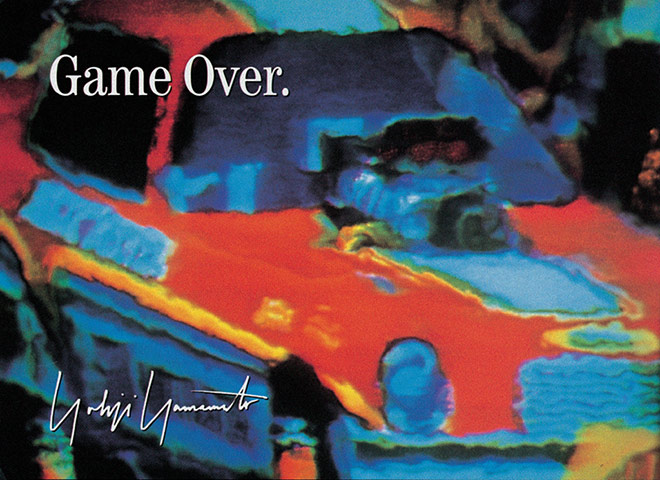
‘The recession of the early 90s informed the nihilistic point of view that Yohji and I shared and expressed in this campaign’ Peter Saville
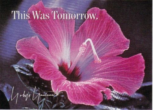
For the first campaign, Saville juxtaposed stock photographic images with caustic slogans like Game Over. Yamamoto’s distributors were horrified: not only were their own advertising predicting the end of their industry, it didn’t even feature the clothes. Saville softened the following season by including the clothes: but styled just as they would be in real life: by a model shooting hoops and an artist dripping paint on to a canvass.
Peter Saville’s “MEANINGLESS EXCITEMENT” for Y-3
Peter Saville recently teamed up with Y-3, the sportswear hybrid between Adidas and the celebrated Yohji Yamamoto, for their s/s 2014 collection. Saville worked with Yamamoto for a series of spectacular prints and distorted slogans as well as for the collection’s campaign, which was titled “Meaningless excitement”. Coinciding with a Suzy Menkes article in The New York Times, titled “Sign of the times: the new speed of fashion”, Saville was inspired by contemporary internet culture, the constant look for the next big thing and the height and depths of the fashion world. He brought together seemingly unconnected references, images and words from online forums, social media and personal blogging platforms, and created an acid house paradise, standing on the thin line between the poetic and the political.
.
.
With slogans like “This message has no content, are you sure you want to send it?”, “Change that works for you” or “Everything is not $1.00”, the collection was characterized by a strong and bold attitude that reflected Saville’s quest for “portraying the brokenness of things, the kind of saturated backdrop”. “We find inspiration in our constantly changing world”, said Yohji Yamamoto about the collection, “It never remains the same, and we never lose our endless desire to capture the new.” A playful critic on fashion’s obsession with the short lived and, at the same time, a celebration of its transformative qualities, “Meaningless excitement” was everything but pointless. Japanese tradition met all-American sportswear, the minimal cuts of Yamamoto were side by side with Saville’s English wit and the new generation of internet-obsessed kids finally found their dream wardrobe. Saville and Yamamoto did it again!
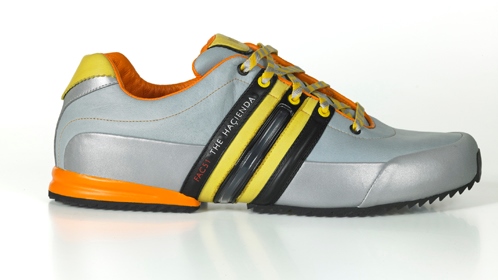
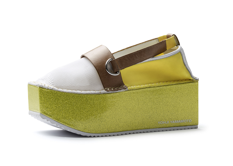
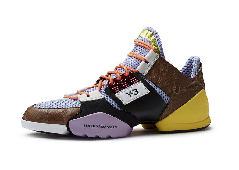
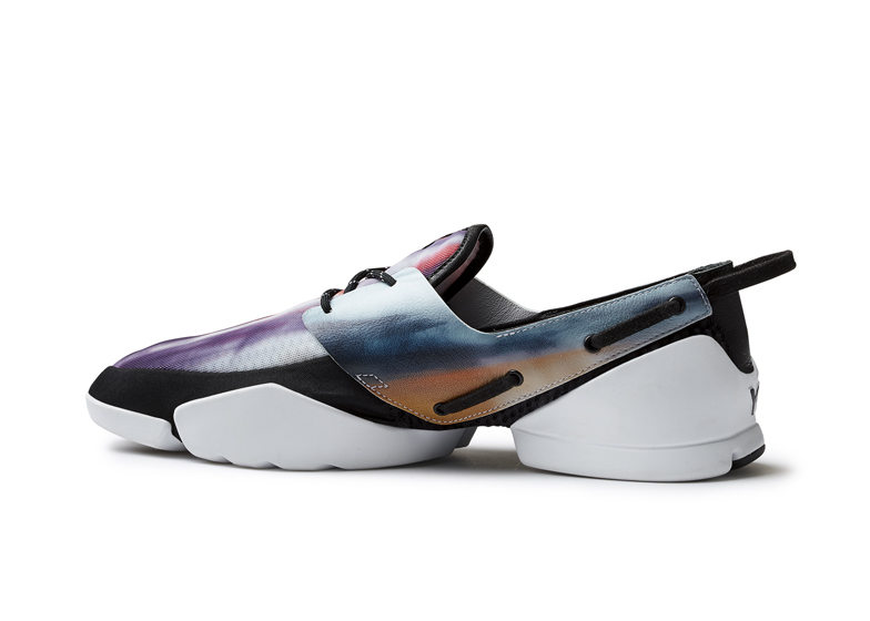
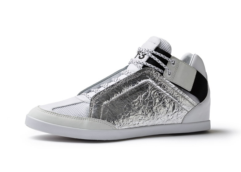
S/S 14′ footwear by Y-3 & Peter Saville for Adidas
Adidas/Y-3 FAC 51 Hacienda trainers (named after the club: The Haçienda)
.
Book
Yohji Yamamotoby Ligaya Salazar
Yohji Yamamoto is one of fashion’s continual innovators and this stunning book is a fascinating insight into his working approach and relationships with other creative practitioners. This comprehensive and groundbreaking volume includes an insightful interview with Yamamoto, as well as a roundtable discussion with some of his key collaborators, among them Nick Knight, Peter Saville, and Marc Ascoli. Photographer Max Vadukal, who has been working with Yamamoto for more than 25 years, is interviewed by Terry Jones, and long-time collaborator Masao Nihei contributes an essay on some of the wider influences on Yamamoto’s designs and how they are presented.
Beautifully illustrated using amazing photographs from the likes of Nick Knight and Paolo Roversi, selected from the Yohji Yamamoto archive, this will be an invaluable resource for anyone with an interest in fashion and design
Publisher: Victoria & Albert Museum. ISBN-10: 18517762. ISBN-13: 978-1851776276
.
.
Info for this post:
Official website Peter Saville: http://www.petersaville.info/
Raf Simons was born on 12 January 1968 in Neerpelt, Belgium, to an army night watchman (Jacques Simons) and a house cleaner (Alda Beckers).
Raf graduated in Industrial Design and Furniture Design from a college in Genk in 1991. He began working as a furniture designer for various galleries, having previously interned at the design studio of fashion designer Walter Van Beirendock (who was part of the original wave of Belgium designers, the Antwerp Six) between 1991-1993, working on the interior design of the showroom.
Van Beirendonck took him to Paris fashion week and that was when Raf first saw a fashion show — Martin Margiela’s all-white show in 1991 — which inspired him to turn to fashion design.
Raf Simons label
f/w 1998 ,Ph. Bert Houbrechts
Encouraged by Linda Loppa, head of the fashion department at the Antwerp Royal Academy, Raf became a self-trained menswear designer and launched his Raf Simons label in 1995.
His first collection was in Fall-Winter 1995, and featured two street models in a video presentation.
f/W ’95, Raf Simons first collection
.
From Fall-Winter 1995 to Spring-Summer 1997, Raf Simons’ collections were shown either in presentations or videos. Fall-Winter 1997 saw his first runway show in Paris, France with a look of ‘American college students and English schoolboys with a background of New Wave and Punk’.
F/W ’97
.
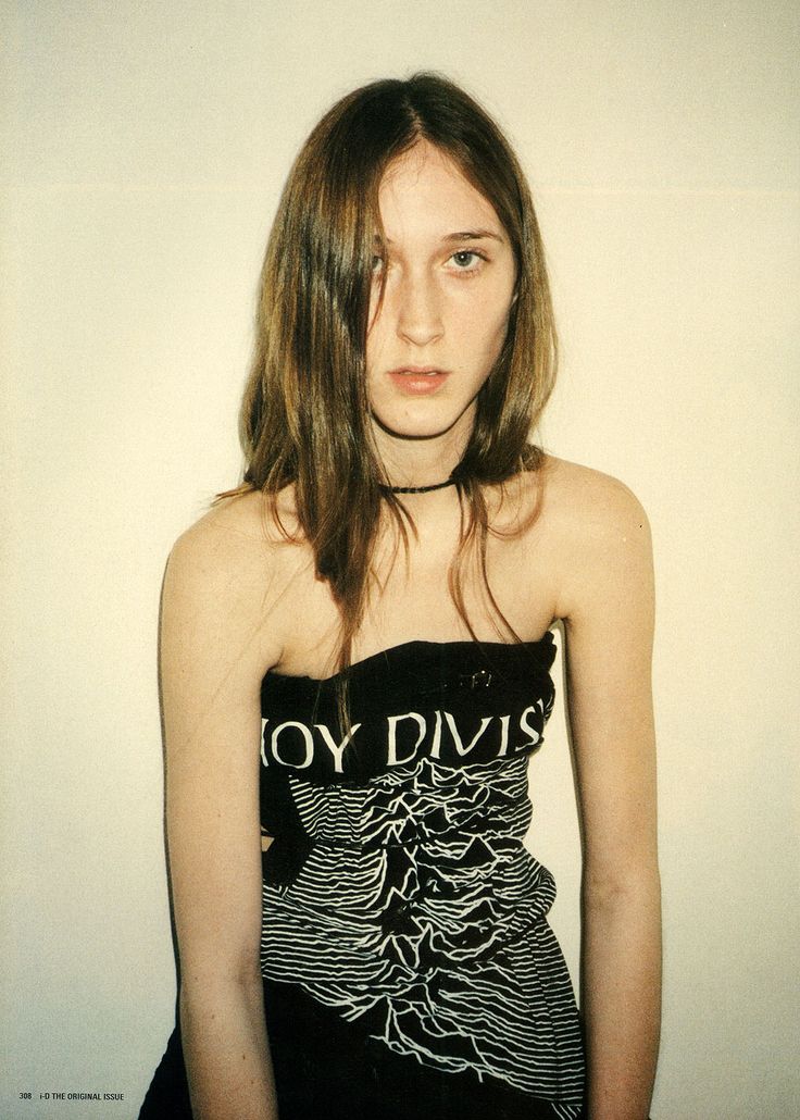
Raf’s early aesthetic incorporated youth culture from different sources, such as the Spring-Summer 2000 collection taking inspiration from both MENSA students and the Gabba youth subculture (a predominantly Dutch and Belgian movement associated with hardcore techno music). Music has formed an integral part of his work, with references to musical figures such as the Manic Street Preachers’s Richey Edwards and Joy Division’s Ian Curtis and his Fall-Winter 1998 collection (Radioactivity) featuring members of German electro band Kraftwerk as models.
Richey Edwards
Richey Edwards
Ian Curtis
Ian Curtis
Kraftwerk
.
f/W ’98 part 1
f/W ’98 part 2
.
I attended the f/w ’99 catwalk show myself and it was pretty impressing. This was the collection Raf Simons presented his spectacular long black capes.
F/W ’99
In March 2000, Raf Simons shut down his company to take a sabbatical after his Fall-Winter 2000 collection (Confusion).
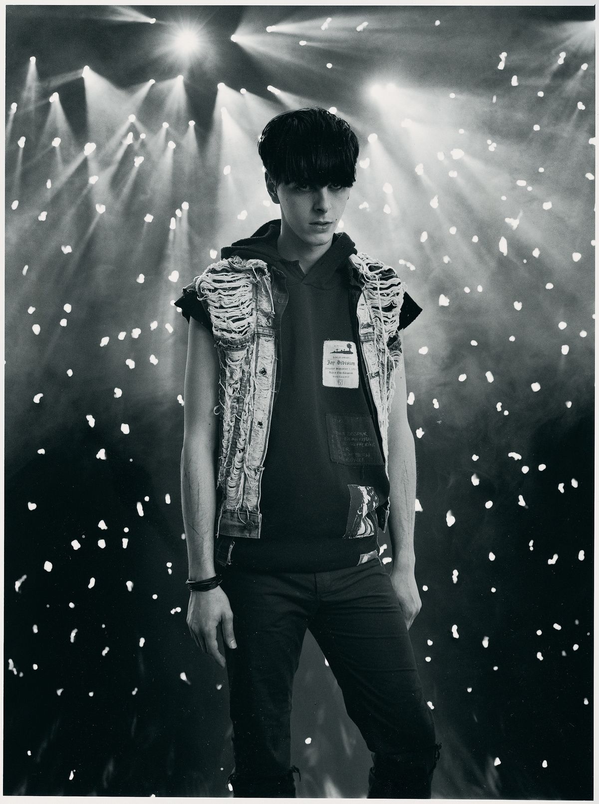
For his Fall/Winter 2003 collection, Raf Simons was granted full access to the archives of Peter Saville, a living legend known for his graphic design work, much of which takes the form of record sleeves. Saville started art school in the mid-1970′s and then began working with Factory Records shortly thereafter. A partner in the Manchester-based label, as well as its artistic director, Saville was tasked with the creation of the Factory artists’ record sleeves, although he got his start designing posters for The Haçienda nightclub, which was run by the label. Inspired by Kraftwerk, a German electronic music band formed by Ralf Hütter and Florian Schneider in 1970 and a favorite of Raf Simons, and their Autobahn album sleeve, Saville went on to design the sleeves for Joy Division and New Order, among others. Rarely given any direction from bands regarding the artwork, Saville says, ”I was left to my own devices … I never had to answer to anyone.” This was especially true given the “non-commercially structured” nature of Factory, which “allowed us to make statements that we believed in and wanted to make, without much compromise,” said Saville.
.
Book
Isolated Heroes by Raf Simons & David Sims (photography)
The series of photographs, collected under the banner ‘Isolated Heroes’, are the result of the collaboration British photographer David Sims and Belgian menswear designer Raf Simons undertook in the summer of 1999. Featured on the pictures are Raf Simons’ models, dressed in his collection for Spring-Summer 2000.
Each boy is credited with a serial number and his own first name. ‘Isolated Heroes’ contains both black and white and colour photographs. Originally intended as a work-in-progress, Sims’ photographs of Simons’ models soon became a body of work in it’s own right. The photographs of ‘Isolated Heroes’ were never intended for mere promotional purposes. They even transcend more traditional fashion photography, as they reach for a timeless quality, devoid of signs of the times or traces of trendiness.
The ‘Isolated Heroes’-project deals with beauty, youth, masculinity and the perfect isolation of all these preoccupations. Sims and Simons share the same notions of aesthetics: honest, untouched, pure and real. Not one of the portrayed boys in ‘Isolated Heroes’ is a professional model. They are either too ‘strange’ or too ‘ordinary’ to fit the mold of supermodels. Yet, through the eyes of Sims and Simons, they are made visible, without the aid of gimmicks or theatrical enhancements. ‘Isolated Heroes’ is a sequence of faces and expressions, mindful boys and stern young men, their gaze fixed. They express nothing but their own personality.
The photographs don’t make them more beautiful, as in traditional (fashion) portraiture; each face is a peaceful vindication of modern perception of beauty, a resolute alternative to the clichÈd glorification of male strength. In narrowing the close-up on the faces, Sims and Simons have created portraits in an almost classical sense. The images evoke memories of Classical-Greek statues and postures, further enhanced with lighting, clear backdrop and focus.
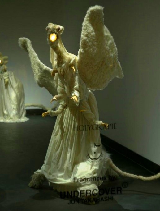
Designer Jun Takahashi of the ‘cult’ fashion house Undercover makes dolls. They’re called Graces and he makes them out of metal and teddy bears and light bulbs and other things.
Jun Takahashi: ‘The Graces spontaneously come out of me, genuinely, while making clothes is something more calculated, an entire process that requires teamwork. But doing both allows me to keep a balance in my creativity. Therefore, it makes sense to me to have everything linked.’
Takahashi collaborated with perfume brand Comme des Garçons to release two new perfumes named after his own fashion label Undercover and inspired by his fantastic plush animals, the Graces.
The fragrances are called Undercover Holygrace and Undercover Holygrapie.
.
UNDERCOVER for Uniqlo called UU
UNIQLO collaborated in a design project Jun Takahashi and his Undercover fashion label. It debuted in 2012 and is called the UU collection which focused on a family theme, with a full lineup of apparel for women, men and, for the first time in 10 years, UNIQLO UK also offered kidswear to the British market!
.
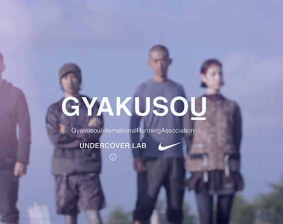
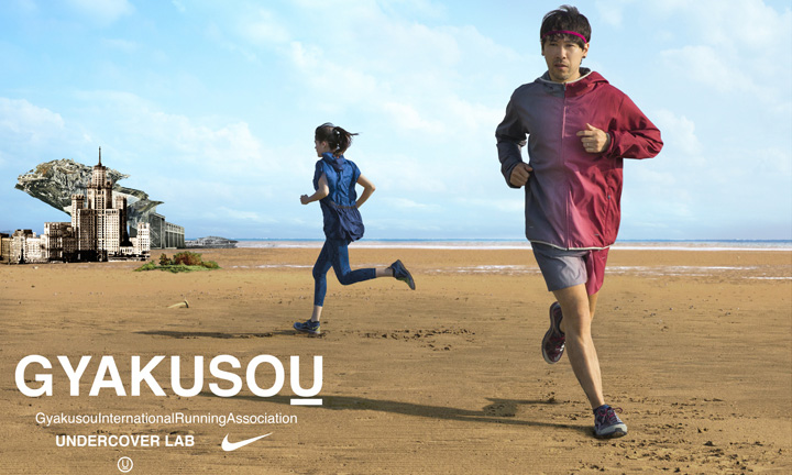
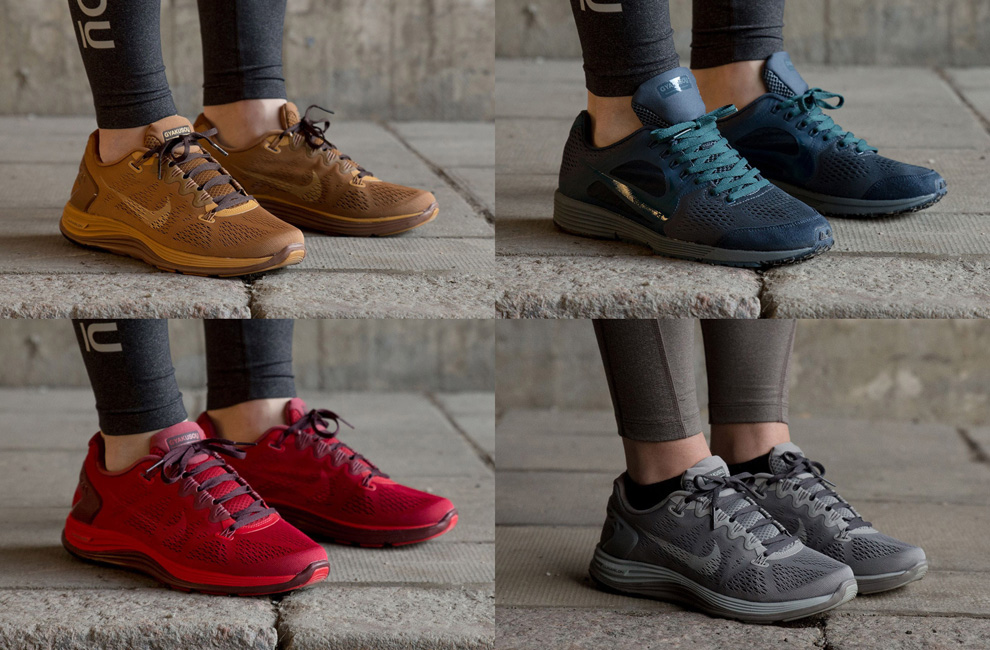
Nike x Undercover = Gyakusou
In October 2010, Nike and Jun Takahashi’s label Undercover, released the first Nike x Undercover Gyakusou performance running collection. The design partnership fused cutting edge Nike running innovations and design with the functionality of Takahashi’s Undercover.
Takahashi began running six years ago “I run 12 or 13km every other day. It’s kind of like meditation to me – but with adrenaline. It’s part of my life. I have to run.” Gyakusou takes its name from a group of Tokyo-based runners who passionately run in their city. The name Gyakusou comes from ‘gyaku’ meaning wrong way or reverse and ‘sou’ meaning ‘run or running’. It draws upon a shared obsession for design innovation and improving the performance of the athlete.
“Style and functionality is very important and when I started running, I looked very closely at the color and styling of products as well as their performance attributes and functionality. We both wanted to create an authentic performance running collection from the point-of-view of the actual runner.” A technical approach is sustained throughout, ensuring Takahashi’s run remains a mobile personal space where he can concentrate, unwind and continually achieve.
Jun Takahashi
.
Amazing Runway Outfits
Fall/Winter 2003
Fall/Winter 2006 collection ‘Guruguru’
Fall/Winter 2008-09
Spring/Summer 2009
.
Runway Headpieces
.
info official website: http://www.undercoverism.com/
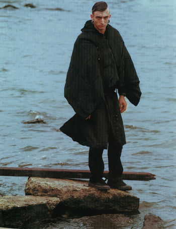
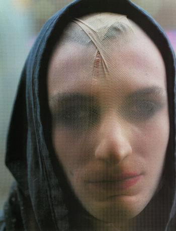
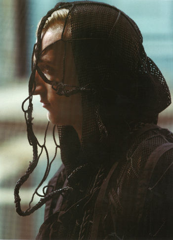
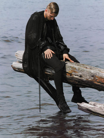
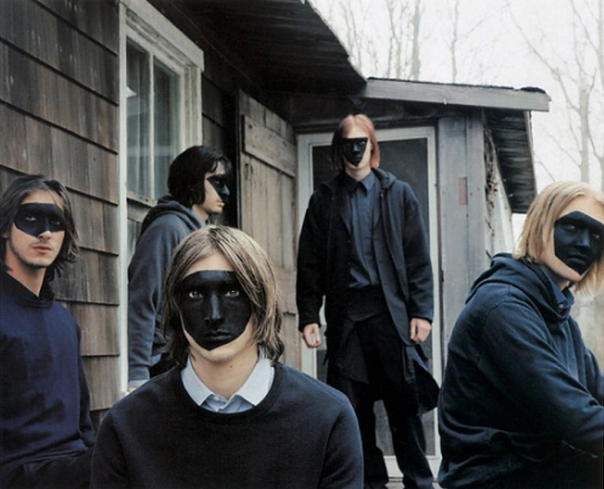
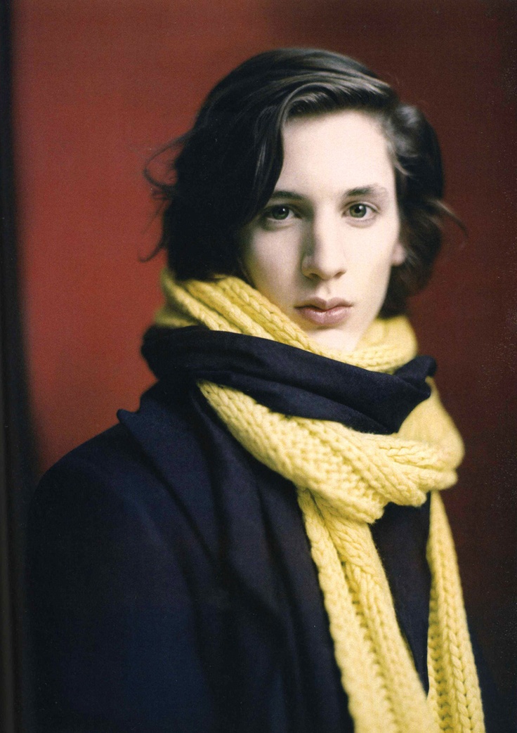
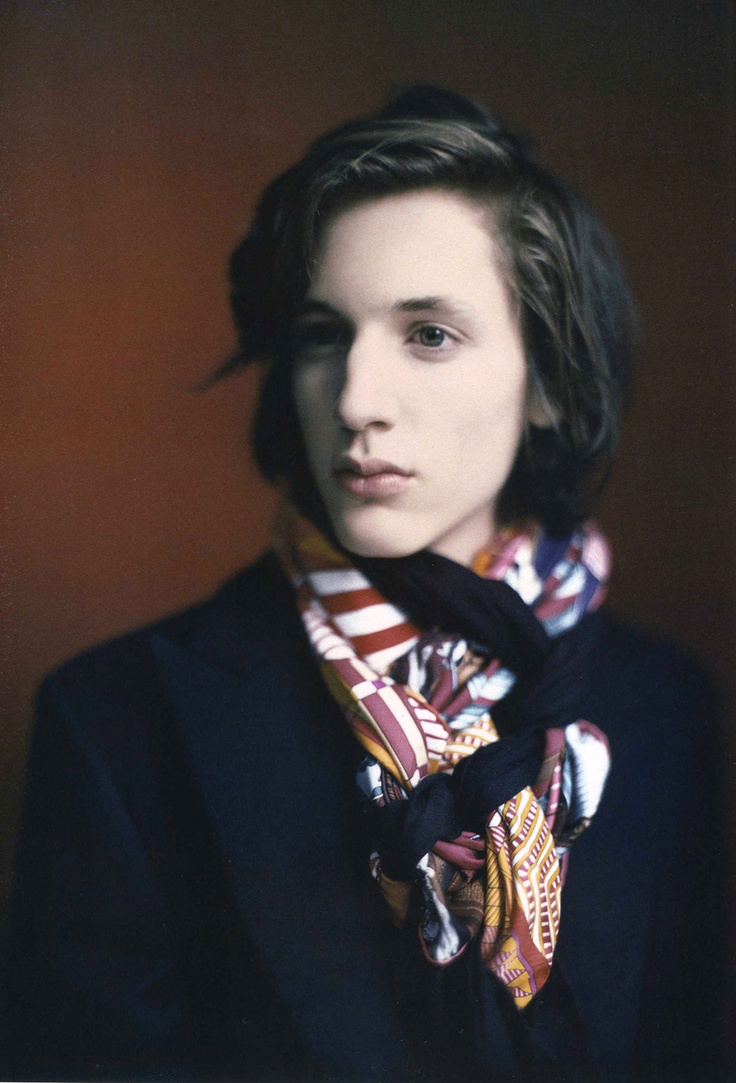
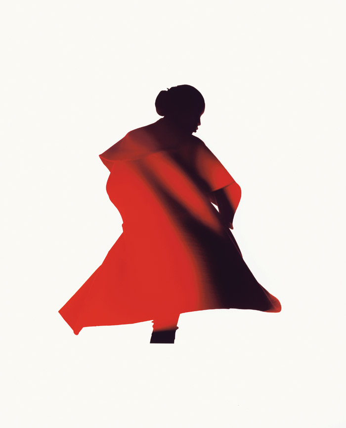
 Filpi Arikcx & An Vandervorst, ph. Ronald Stoops